
--- Comments
What is this? an iPod?
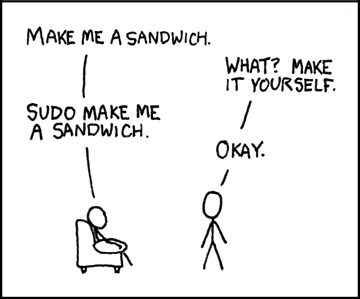
sudo Make Skins
Neat design
xkcd did that joke already except with sandwiches, and sandwiches are delicious...
can't be arsed to find the link however
Messy and one hell of a bad design and structure! No shortcuts to the first or the last comic. If you are at the latest comic the "next comic button" is unclickable (good!) BUT it is square insted of round! (due to IE6 does not support png with transparency) Insted of textbuttons you have PNG pictures that does not go very well with IE6! You have so many design flaws in this design so i dont even know why you published it!
freestream - Really? I thought I fixed the png-issues in IE6.. I'll have to look that over again. No link to latest/first is intentional. So, that's one design flaw, which will be fixed asap.. which wasn't intentional, anything else? Constructive criticism is welcomed, please go on man, that's the only way to fix it :)
WampDiesel - I don't read xkcd :-/ If I had, I'd probably not made the same joke :-(
One more thing, your advertisement that should be on the right side is in the bottom of the page in IE6. Alsow the Feeds, Friends in crime etc. fields border have different design depending on with browser you are using (in my case IE6 and Firefox 2.0).
jesus crap, I checked all that.. oh well, back to work for me >_< Thanks for the heads up man.
Hey Lil' Gamers! Very nice Nju page design. I want my wallpaper back tho! And the tagging feature - I used that all the time. Maybe I'll try the RSS instead...
ffs.. if you still use teh ie6 you DESERVE crappy designz on you internets.
Hey, it's not our fault IE6 sucks ass. They just browse our interwebz. But First/Last links, well, you know home brings you to the latest and everything else is available under archives... you know.
Samuel, IE6 is one of the most commonly used browser in the world. It is not so east just to igonore issues that affect the bigger part of the world.
Hey people, I figured out the RSS link for the whole site: http://www.little-gamers.com/feed/.. The "RSS 2.0" link in each comments page is an RSS to that particular comments page..
First/Last links -> Christian I meant the tagging feature (Tag this comic) - Its good for people who don't check the site every day (I used to link to an older comic in the archive, then click "Go to tag" and Then browse through the new comix right till I got to the latest and tag it .. that way I haven't missed a single LG =) But I'll use the RSS instead now-much easier.
"Tag this comic" will be back when I get back from my vacation if I can't fix it before I leave :)
for reference: http://xkcd.com/149/
It is pretty funny that you came up with the same joke. Honestly, the joke doesn't make sense to me anyway. How many people have a significant other simply named "root"? I've known a couple people with the last name "root", but it wouldn't work for most people.
The command should be "sudo -u $(SIGNIFICANT_OTHER_UNIQNAME) ...". Oh well. I'm too much of a *nix geek to enjoy the joke :-(
A question, should the advertisement be on the right side of the "Feeds" field or under "Yearly archive"? because right now it is under "Yearly archive" in IE6
Man, this comment thing is awesome, now we get all the feedback that you are too lazy to email us ;)
Like the new look, but i do miss being able to read the old rants in the archives... even though they were old they did kinda let you know what was going on in the world on that day and read a little comment about it (no, i don't read/watch the news... i like upholding the title of ignorant american =P)
Mr.Madsen, this is it:
http://imgs.xkcd.com/comics/sandwich.png
I love your comic, but honestly, xkcd made this one better :)
@mr.madsen
You don't read xkcd? Shame on you!
Go stand in the corner after adding it to your preferred bookmarking or feed reading tool!
CTRL+A will reveal your sins! Over and under the comic strip is img tags, make them insted a part of the css code. The highligt of the links is greate, you know it is a link but the forward and backwards buttons does not have this feature, that is bad!
And of course i meant the border around the strip in the last post i sent
freestream - noooooo, no img-tags there.. well, yeah, there is :) Not that that really matters, that's not what fucks up the part with the banner/linkpad, besides, it actually fills a function.
If thoes img tags have a function how do you defend the meening of the blue/green/thing at the top the page? :P it feels....a bit of!
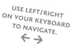
for some reason the arrows on the side of the comic are invisible to me.
and good call on killing the link to the first comic. i've clicked that button at most 6 times, and 4 of them were by accident >.>
freestream - I've sent you a mail, in swedish, hope you don't mind.. and the thing in the top, that's DESIGN! ;) .. and we will use that for something special later, just wait and see :)
greeny - what's your setup?
firefox 2.0.0.14 default skin vista/maybe it will work right next update
figured out myself.... the contrast was too high. But that is the first time it has completely erased a button.
LOL, nice one greeny :D
mmmmmm, tranquil design...... no...must stay awake,.... read funnies...... zzzzzz.....wtf is xkcd...... zzzzzzzzzzz
Argh! arrow keys moving me away from this comment input page/box thingie!!!! (3rd time I've tried to write something here!) (firefox 2)
NOT GOOD!
Now, what I was going to say...
Grey on grey is rather hard to read....
Darker text or lighter background plix :)
Mr_Chicken - It's be fixed now :)
Oh, nice quick load time on my work computer. gj
:D
More colors plz thx
@Christian hopefully you'll get some feedback from the peeps who have 'always' been too lazy to email too. this may also lead to lack of sleep, but i'm glad you've brought this upon yourself ... shows the love!
@MrMadsen - You should maybe likes the xkcd, tho they're quite hit or miss, some gems there, the 2 of you are the only ones i check religiously, so hopefully this convinces you :)
Oh & it all looks kick-ass to me ... congrats on the smooth shift over!
I like the design, but the text colour is a bit too light.
It needs to be solid black rather than mid-grey.
Fecking Schweeet! Now we just need the spammers to figure out how to post porn links
Horribly lacking the 'tag this comic' button. Bring it back, pretty please?
Nice design! also fuck IE6
I've never loved XKCD, the art irritates me. I mean, I know that's not the point and stuff, but it just grinds on me...
Good stuff Mr. M.
Neat design, I just miss being on my laptop cause IE6 really sucks but at least I can read you even if that b**** died this morning(laptop)
Mr.Madsen: I still have the proble with arrow keys moving an the comment box thingie.. and I'm using Safari. it happend like 5 time while writing this. I almost threw my Mac out of the window!
password:
Kickass design, but will miss the old one to ofc
Just love the comic, the best on the net by faaaaaar
Keep it up guys ;D
http://xkcd.com/149/ You should give it a read madsen, I think you'd like it.
Mr.Madsen: never mind.. it seems to work now.
Sudo read XKCD.
Seriously, it's nearly as cute as LG.
Hehe, even if it was used my xkcd that joke never gets old ;)
she forgot to say the password :P
I liked the XKCD one when i saw it, and i like this one now, despite the similarity, the two of them have their own joke style so it's cool.
sudo what?
Sudo will!
http://en.wikipedia.org/wiki/Sudo
A great subtitle would be, 'Or why geeks shouldn't get married.'
Might want to mention that the arrow keys to scroll left and right seem to have an issue for me in Internet Explorer 7 (who uses it anyways?)...but work seemlessly in Firefox.
Email me your setup, and WHAT that's not really working :)
"Seems to have an issue" doesn't give me much to go on ;)
I don't like how the the fonts looks on FF3 RC1 and Vista. They look blurry, like when using a non-native resolution.
Site looks great, FF3 RC1, Ubuntu
@Darkstar IE doesn't follow the standards correctly, so if IE is the one not working right it's because Microsoft just does what it wants and doesn't care about you the consumer.
I wants psp site again D:
Looks awesome on a computer though =]
hilarious none the less
Tisk. Whether or not you had read the comic beforehand, xkcd famously beat you to this joke years ago and it looks bad :P
http://xkcd.com/149/
@Fara: You probably have the site zoomed. ctrl+mousewheel can zoom in and out in FF3, but will make any text in images blurry as a result. The setting change is preserved across multiple viewings of the site. If you don't know how it should look, it can be hard to detect.
This was a bit of a shock when I first logged on the other. The new site changes are keeping with the times as well as user friendly and organized. However, it would be nice to see the site broken up with a bit of extra color other than the light blues at the top. Grey gets repetitive after a while ^.^
*edit* I meant "the other day" in the first line. ^.^;
I read the other comments before replying myself, unlike most of these punters, so I won't mention xkcd or anything.
I really like this new design, very smooth. My only problem is that the URL for each comic is by date now, instead of numerical order, which makes it difficult to keep track if (like me) readers only check in every week or two. If you could restore it to numerical order that'd be choice!
Love and cookies.
love love love
